Grand Slam Serve Speed
When do top-ranking tennis players serve their fastest balls?
Probably not in a Grand Slam final.
This visualization explores the serves speed from the top-ranking male tennis players. This project maps all the matches from 2011 untill 2017 of the the Grand Slam tournaments–the Australian Open, Roland Garros (French Open), Wimbledon and the US Open.
In recent years, these tournaments have witnessed many technological innovations on the court and on screens. IBM is the technology partner of all the Grand Slam tournaments providing hardware and analysis tools that capture data in real time from the courts. IBM uses Radar Guns — similar to devices used by police to measure how fast cars are driving — to determine, with great accuracy, how fast the ball is travelling.
The serve speed is measured right after the ball leaves the racket head and provides the speed in real-time to the players, spectators, commentators, statisticians and journalists during the game.
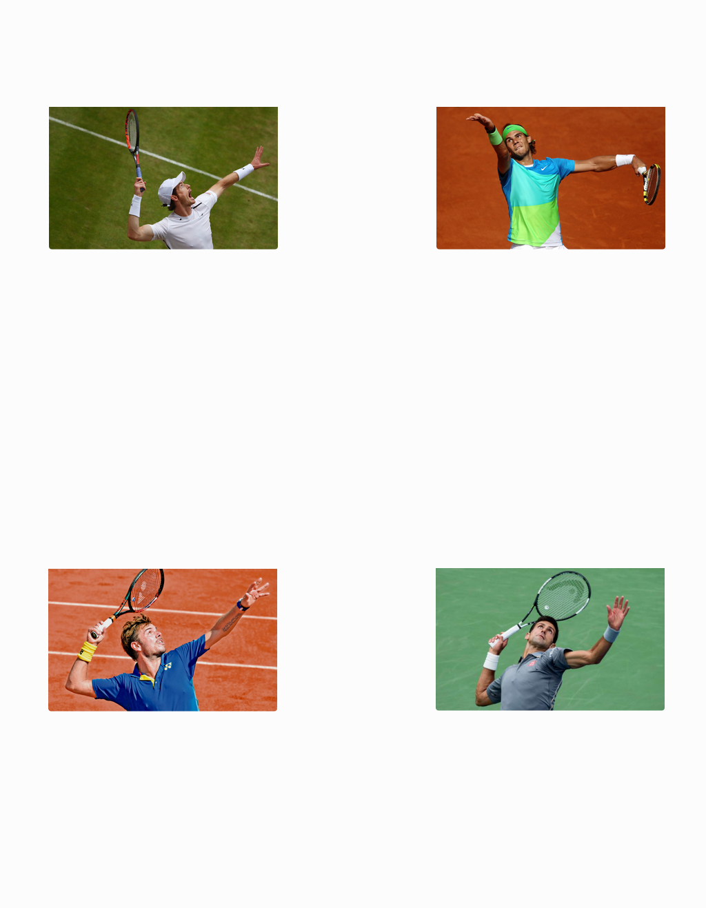
If you assume that the fastest serve performances are made during the most crucial matches, such as the finals, your assumptions might not be completely correct. The fastest serves by the top four male tennis player, based on the 2017 ATP rankings, were isolated and charted below to show in which tournament's round they were performed. Between all the Grand Slam quarterfinals, semi-finals and finals, the matches in which the best performances were played are highlighted.

Fastest serves do not happen on a final
By taking the four top-ranking tennis players as a case study, it is possible to drill down into a single match and analyse its serve trend. The match is outlined by all the serves performed by each player. By showing the difference between points of maximum and minimum speed, the user is able to visually compare the players’ serve strategies in the selected matches. In addition, each player’s profile below shows how the player's serve performance varies across the rounds of all the Grand Slam tournaments.

About this project
As my last internship project at Interactive Things, a Swiss digital product design studio, I was curious about exploring a subject at the intersection between sport, technology and data. Tennis is the perfect ground that presents a fair amount of data with hidden complexity and intrinsic correlations.
I've spent a significant amount of time during my process understanding and searching for data. Once I had a solid data set, I moved to Tableau for my initial exploration. Since there was no documentation in the data file, I gained familiarity with it while investigating the correlations and exploiting the possibilities. I've avoided to focus on any correlation that would have linked the serve speed to other variables, e.g. the correlation between serve speed and aces rates or the serve variation by player. My assumption, that top-rankings players never perform their fastest serve in Grand Slam finals, were verified with the analysis of the first five players, but I am curious to map the results of many more.
Take-away
Asking a few good questions, helped me to focus my research, to test my assumptions, to refine my concept, and prevented me from getting lost in neverending data exploration.
Image Credits
1. Clive Brunskill, Getty Images
2. Julian Finney, Getty Images
3. Francois Xavier Marit, Getty Images
4. Paul Chiasson, Associated Press
Data Credits
Grand Slam point-by-point Data, 2011-2017 scraped by Jeff Sackmann from the four Grand Slam websites shortly after each event.
Thanks to...
Luc, our newest team member and data wizard, who supported me in the exploration of the data set. And to everyone one at Interactive Things for their valuable contributions and learnings.
Project by Greta Castellana.